Harpers Design Awards 2022: The results
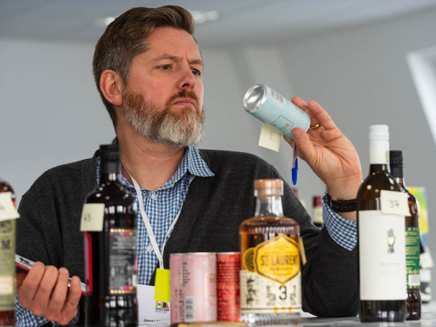
Judging the package, rather than the liquid within, is always an eye-opening and interesting exercise, and this year’s Harpers Design Awards once again delivered some sublime entries worthy of celebration. Andrew Catchpole dips in.
At a premium level it’s only the quality of the liquid in the bottle that will persuade a consumer to return for a second purchase. But judging a wine, spirit or beer by that alone is to miss both an important step in the purchasing decision and the fact that studies have shown that good-looking packaging can actually enhance our experience of the liquid within. Put another way, the trade needs to persuade the customer to choose a given bottle in the first place and expectation, built up by packaging cues, is also part of the deal when it comes to boosting organoleptic pleasure.
Thus, design is important, which is why the Harpers Design Awards is so popular with our judges each year. And, while rigorous, the judging session is also a highly enjoyable exercise. After flights of drinks arranged in various categories have been judged without conferring, scores are collated and the debate begins over which of the highest-scored products are worthy of being elevated to the very highest position – as champions in their category – by the panel.
In the past, spirits have generally fared better than wines, with more overt and impressive designs wooing our judges, while the latter have been less even in the quality and attention given to their appeal. This, though, has been fast changing and, over the past handful of years, wine appears to have caught up, with our panel agreeing that, overall, there were more striking and subtly clever designs on the wine front than with the spirits. Both categories, however, delivered many superb examples of how great design can really enhance a product’s appeal, while giving commendable cues as to the style of drink, possibly the story or ethos behind it, and all while helping along that all important sale.
Congratulations from the Harpers team to our winners and to all who entered this year, for collectively setting the bar so high and standing to be judged by both professional designers and wine trade peers. Here, then, are the results of the Harpers Design Awards 2022.
Design Awards Judges
Rosie Milsom, global head of NPD, Atom Brands
Riaz Syed, director, Stonewines
James MacKenzie, head of marketing, Alliance Wine
Paul Marsh, design director, Butterfly Cannon
Andrew Catchpole, judging chair and editor, Harpers Wine & Spirit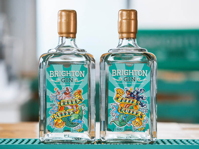
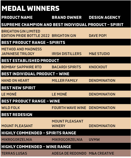
SUPREME CHAMPION AND BEST INDIVIDUAL PRODUCT – SPIRIT
BRIGHTON GIN LIMITED EDITION PRIDE BOTTLE 2022
Brand owner: Brighton Gin
Designer: Dave Pop!
Brighton Gin’s annual limited edition Pride bottling was found to be fabulous in several senses, “exuding positivity and fun”, catching the eye in a seemingly subtle but actually quite complex twist on this product’s usual presentation. Celebrating the vibe of the annual LGBTQ+ parade in its home city, the designer playfully used ‘merpeople’ images with the playful words ‘Cheers Queers’ on the label, described by judges as “charming”, “engaging” and “bang on brief”.
With a percentage of the sale price going to The Brighton Rainbow Fund charity, local designer and artist Dave Pop!, known for the seaside flavour and sauce of his pop art, has individually signed and numbered each bottle, adding to its collectable, one-off appeal.
The judges were unanimous in awarding the Supreme Champion and Best Individual Product – Spirit awards to this Pride edition of Brighton Gin, recognising both the skill with which the design had been executed and – in a word used by almost all in their judging notes – doing this while having “fun”. A joy to behold and just as good to drink!
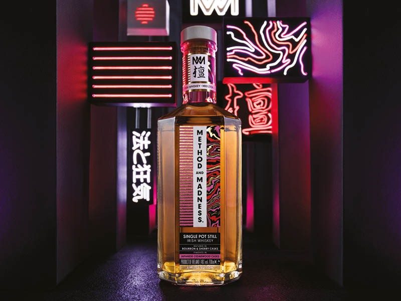
BEST PRODUCT RANGE – SPIRITS
METHOD AND MADNESS JAPANESE TRILOGY
Brand owner: Irish Distillers
Design agency: M&E Studio
Method and Madness, the experimental arm of Irish Distillers, released these three Irish pot-still whiskies having finished each in a different Japanese wood, with the essence of each barrel subtly infusing the spirit. Step up M&E Studio, whose brief was to capture this story and communicate the exclusivity and qualities of the spirit via the design.
The resultant bottle and label were a big hit, being “eye-catching” with “nice execution of finishes”, with judges praising the “beautiful tactility”, the “coherence of range” and the “modern, forward-looking design”. The imagery cleverly wove the Japanese theme into the mind, while also hinting at the styles of the whiskies inside, leaving little doubt in the mind of the potential purchaser that something exotic and beautiful would be delivered by the liquid itself. A triumph of design.
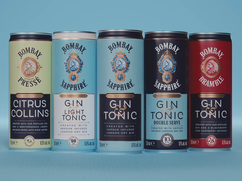
BEST ESTABLISHED PRODUCT
BOMBAY SAPPHIRE RTD
Brand owner: Bacardi Spirits
Design agency: Knockout
The quality RTD market is hot right now, but as choice grows so does the challenge of standing out and communicating that quality on a small can, rather than
75cl bottle. Hats off, then, to Knockout design agency for hitting the brief with aplomb, delivering “great craft and quality cues”, creating a “great, cohesive range”, while “building on the well-known branding”.
The colour scheme, helping communicate the juniper and citrus high notes that are the signature of Bombay Sapphire were praised, as were the fonts,
with the whole suggesting both “quality” and “good value for money”, with one judge going as far as saying “the cans are even more appealing than the bottle”.
Given the portability of this pre-mixed G&T, and the relaxed occasions at which it is often likely to be consumed, the smart and standout packaging still retained and communicated a sense of being “fun and engaging”, which, ultimately, won our judges over.
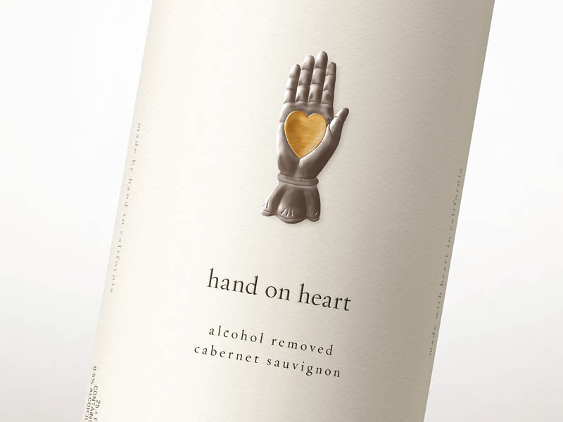
BEST INDIVIDUAL PRODUCT – WINE
HAND ON HEART
Brand owner: Miller Family
Design agency: Denomination
There was much to like about the design of this very on-trend, quality bottling of no-alcohol wine-style drink, aimed at the fast-growing health-conscious and wellness market. Judges considered this to be a “well-crafted and simple design that chimes well with the brief”, delivering a deceptively simple label, showing “really lovely design, delicate and impactful, and cohesive with it”.
From California, the “clean design”, with small fonts on a crisp white background and with the words on the neck foil ‘full of heart not alcohol’ echoing the appealing heart and hand image, this gave strong cues of its modernity, its health appeal, but also the quality of the liquid inside. Proof that simplicity, done well, can produce some of the very best and most appealing design.
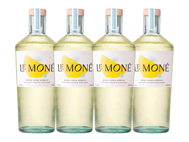
BEST NEW SPIRIT
LE MONÉ
Brand owner: Le Moné
Design agency: Denomination
So often simplicity, or at least apparent simplicity, wins through in this competition, and this stunning bottle and label from Denomination shows why. The clarity and balance of image and label, along with the distinctly shaped, broad shouldered and tactile bottle, speak clearly of the fresh, zingy awakening promised by the citrussy aperitif inside.
This was variously described as a “lovey design”, “well-executed” and “simple but effective”, plus “fits the brief well”. At once “eye-catching” and praised roundly for the “nice, tactile bottle”, this “communicated well” in terms of building anticipation and expectation, while delivering a fresh and modern message.
Whether opened at home or sitting on a cocktail back bar, this product would undoubtedly stand out with its cool, refreshing appeal. A real hit with our judges.
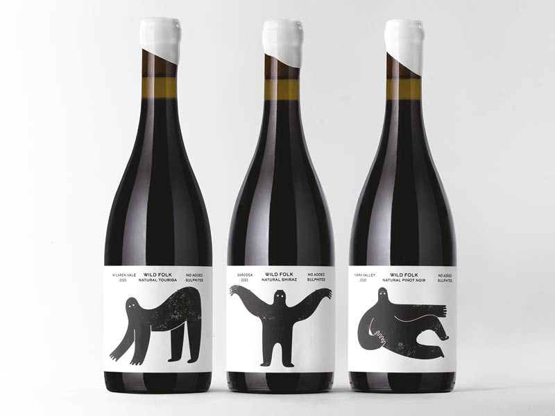
BEST PRODUCT RANGE – WINE
WILD FOLK
Brand owner: Fourth Wave Wine
Design agency: Denomination
Dubbed a “simple, charming design”, the memorable images on this range of organic, vegan and natural wines were an instant hit with the judges, with each individual bottle being highly recognisable, but with a unity to the whole that also tied in very nicely with the name.
A “cohesive product”, with “great labels that tie in with the bottle/wax colour,” being “very on brief” in terms of “communicating the values of the wine” while also having “strong appeal”. The small font was felt to give a “modern feel”, while “nicely balancing” the ‘wild folk’ image on this much-liked monochrome label. Judges were also impressed with both the “organic and clean” feel of the white wax seal, plus its thinness for ease of removal, and similarly praised the “simplicity” of only including the key information about the wines on the front label.
A real hit, delivering loads of shelf appeal, with plenty of cues as to the story and ethos behind the wines, while appearing “friendly and engaging” to draw the expectant drinker in.
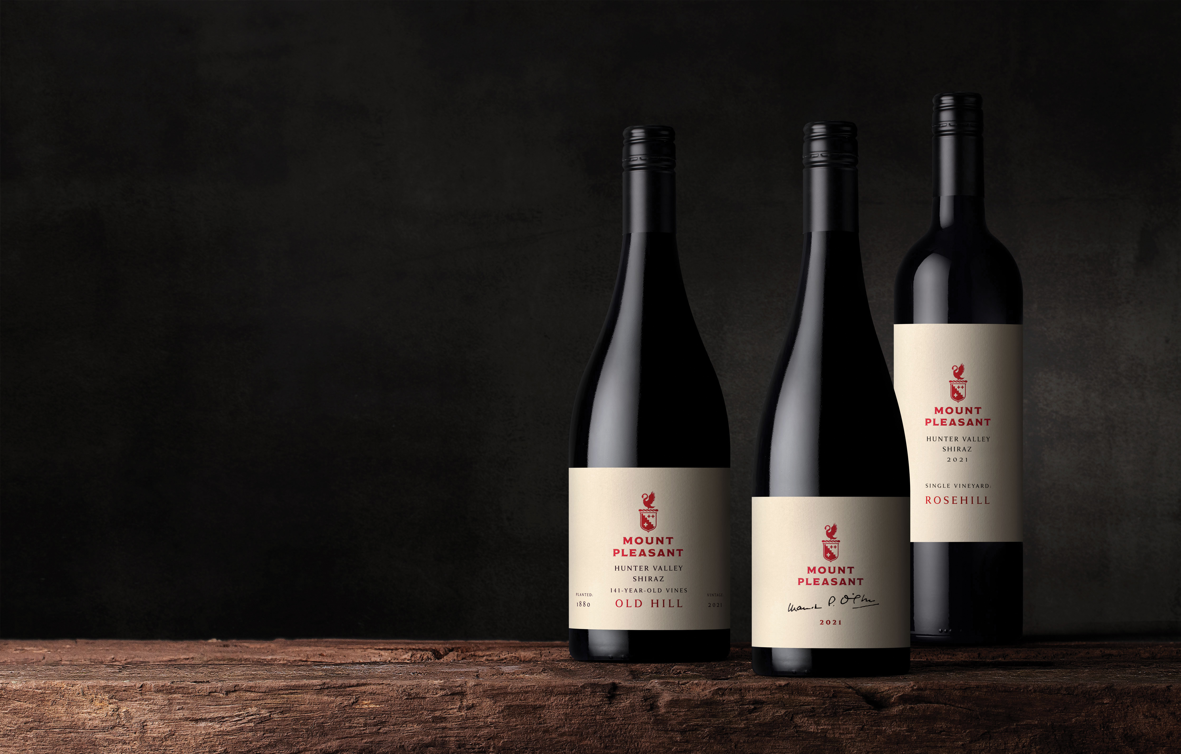
BEST REDESIGN
MOUNT PLEASANT
Brand owner: Mount Pleasant Winery
Design agency: Denomination
Taking an iconic wine brand with a widely recognisable – if quite old-school – label, and getting the redesign right presents a very tough challenge, but one here that the design team have risen to with grace and style.
Considered “a vast improvement … the range now feels clean, elegant and cohesive”, there was good reason to “applaud the attempt to refresh the brand”, which was now “simple and effective”, “a lovely reimagining of the brand”.
What most appealed was the clever way in which the logo was balanced and woven into the new, simple but effective design, still suggestive of the heritage and tradition of this stalwart producer and old Australian labels, but with a subtle modern spin, looking clean and neat and speaking clearly of quality within. Or, as one judge summed it up, “elevated and elegant”, while “bringing together the whole range”.
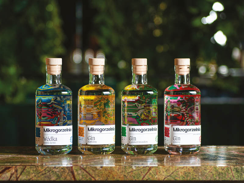
HIGHLY COMMENDED – SPIRITS RANGE
MIKROGORZELNIA
Brand owner: Mikrogorzelnia
Design agency: UVMW
Just pipped for the top award in a highly competitive category, the judges nonetheless were adamant that the Mikrogorzelnia range of spirits deserved recognition for its striking and crisp design. Drawing on the artisanal, craft nature of being from the smallest distillery in Poland, this flavour of the hipper side of Warsaw was summed up as “lovely, simple, playful and engaging”.
Judges admired the “great tactility and use of design elements”, from the simplicity of the naked stopper and the fonts used on the crisp front label (complete with a “nice touch” stamp) to the “highly playful” and colourfully “clever inverted back label”, which gave both immediate appeal and standout recognition to the range without ever being too ‘shouty’.
In conclusion, “a lovely, simple design system with lots of quality charm”, according to one of the designers in the room.

HIGHLY COMMENDED – WINE RANGE
TERRAS LUSAS
Brand owner: Adega de Redondo
Design agency: M&A Creative
While offering “a mash of colour and images”, this range managed the ever-so-difficult-to-achieve trick of allowing each individual bottle to stand out, while unquestionably tying together the whole with harmony. As such, this was described as a “really nice range, with good differentiation” and yet with “good range cohesion”.
Variously noted as “novel”, “colourful” and “playful”, the labels were also praised for individual images that “have impact and draw the eye”, being “subtle cues to assist the consumer” (such as fish, barrels, a lighthouse, a tram, etc), hinting at the style of wine inside. Especially clever was the adept way in which these managed to nod towards Portugal’s traditional side in a modern-feeling and fresh way.
Our judges also praised “a great design system that answers the brief perfectly”, landing this catchy Portuguese wine range an equally jaunty commendation for its eye-catching appeal.
DESIGN AGENCY OF THE YEAR
DENOMINATION
From the redesign of an iconic Australian wine brand to a beautifully enticing new lemon aperitif, by way of a wellness-focused Californian no-alcohol product, all featured here, Denomination also wowed and wooed above other contenders besides. Different all, these were nonetheless designs that drew the judges in, combining elegance, balance, often subtle yet sophisticated attention to detail, with cues that clearly hit the well-executed briefs. In short, a stunning selection of entries that go the extra yards to lift the bar in the drinks world, as often as not with and an eye to appealing to new and younger drinkers, all to the benefit of the wider trade. As such, Denomination is once again the worthy winner of Harpers Design Agency of the Year.
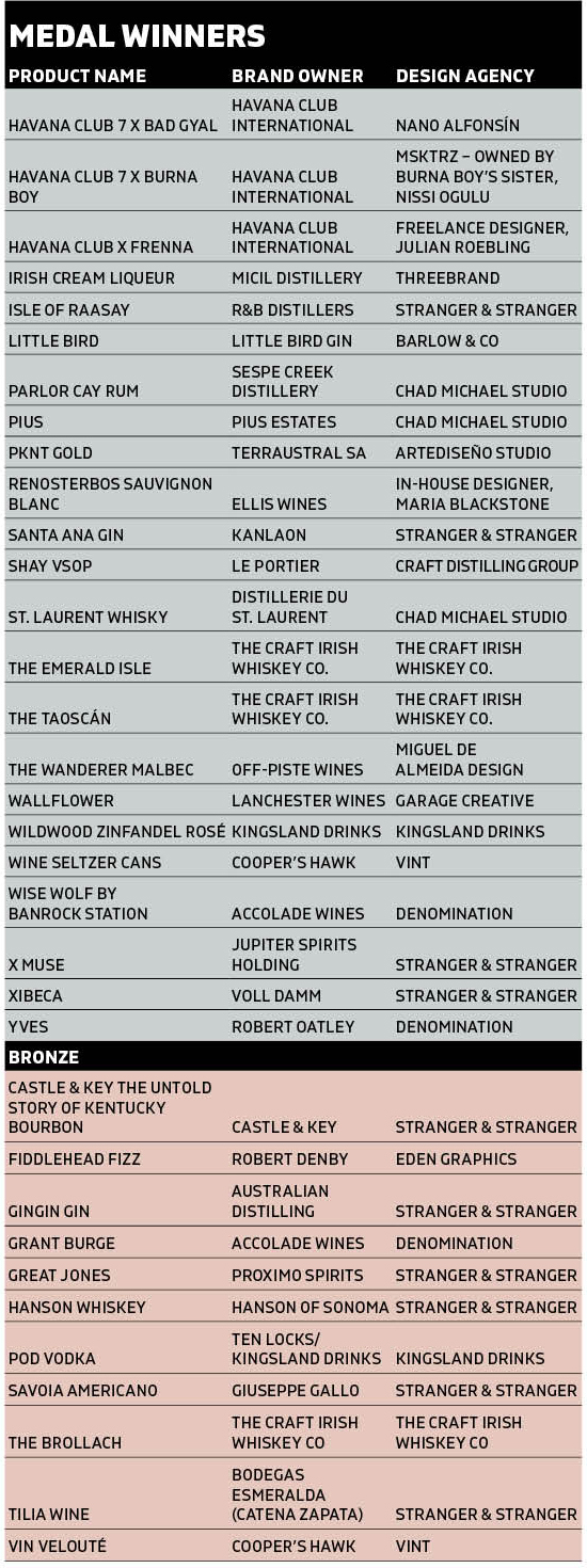
The Results in Full
Keywords:
- Harpers Design Awards
- Harpers
- design
- Awards
- bottle
- product
- judging
- important
- appeal
- Design Awards
- harpers design
- edition
- limited edition
- judges
- design awards 2022
Search
Digital Editions


56-58 Church Walk, Burgess Hill, West Sussex, RH15 9AN
Registered in England No. 6646125. VAT No. 938 4452 95