
Harpers Design Awards 2021 – The Winners
People buy with their eyes and clever design can also deliver strong cues as to what will be in the bottle, conveying clear messages that help bridge the gap between consumer and producer, as Andrew Catchpole reports from this year’s Harpers Design Awards.
With Covid restrictions lifted our judges were once again able to convene in person for our Harpers Design Awards 2021, which took place at our HQ in Sussex in a bright and airy atrium that allowed for good social distancing. As per usual, our judges were tasked with individually noting and scoring each entrant against the judging brief, before coming together – after the numbers had been crunched – to decide on the winners in each category. With in-person interaction back, though, the level of discussion and debate rose to meet the occasion, with a 50:50 split of drinks trade and designer voices on the panel adding to the depth of varying insights and views in the room.
Given this mix, there was a perhaps surprising level of agreement in terms of those products that should be elevated to category winners in the final count.
What also stood out this year was that the quality of design was as high as it has ever been, with wines and spirits vying for attention, delivering stylish, clever, eye-catching and yet often deceptively simple design, with very few misses in the room. Moreover, if there was a central theme underpinning many of our top choices, it was that the more adventurous drinks producers – in partnership with their designers – had agreed to a brief that allowed staid category boundaries to be blurred.
This, in turn, delivered some fantastic and occasionally sublime design solutions. These often had a stated aim of tapping into younger and fresh demographics of drinkers, potentially pulling people across category boundaries, whether that be whisky, gin, off-piste tasting samples or – in the case of our overall champion – fortified wine. And the results proudly lining the judging tables were both refreshing and highly engaging.
As you can see throughout these Harpers Design Awards pages, the initial impact of the overall ‘broad brushstroke’ visual appeal of our winners is high, with much to engage and impress. But, as often, for our judges, the real quality underpinning the design was found in the finer detail, from fonts and colours and subtle visual cues to the materials used, and textures of labels and packaging.
For those who make it their business to buy and sell wines and spirits it’s probably fair to say, with such a diverse and ever-evolving range of products on lists and shelves, the design element has never been more important in engaging with the potential drinker. There’s research that shows good design, allied to the character of the drink in the bottle, can also enhance not just the expectation but the actual pleasure to be derived from drinking what’s inside.
Increasingly, sustainability has a role to play here too. And, as the level of design on show at this year’s Harpers Design Awards suggested, these are messages that are increasingly informing the design and packaging decisions of our wine and spirits world.
Well done from the Harpers team to all our winners and the many entrants that did so well, and for setting the bar higher year on year.
Supreme Champion and Best New Fortified
Cockburn’s Tails of the Unexpected
Brand owner: Symington Family Estates
Design agency: Denomination
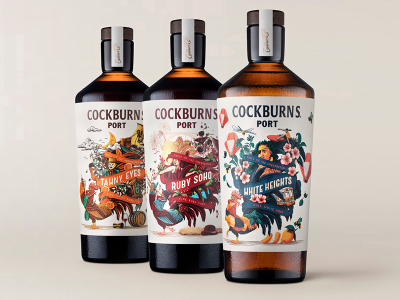
Cockburn’s owner Symington Family Estates had an ambitious plan to reinvigorate Port’s image in consumers’ minds and bring innovation to the category, especially with regard to appealing to a younger demographic. Instructing the design agency to “take Port out of its comfort zone”, the brief also sought to explore the opportunity to reposition the product for on-trade appeal “where the cocktail and craft spirit scene is so vibrant”.
The upshot of this redesign clearly impressed our judges, with comments ranging from: “They’ve gone for it, shaken up the category” and “the turnaround is phenomenal”, while acknowledging that “disruptive to an established brand is very brave”. Such a strong redesign was deemed a game-changer in the ways in which people would interact with the category, making a “big, bold statement”, that revealed “innovation and great belief”.
On the design, “with illustration so nicely done, with so much detail”, the “cocktail shape of bottle, slightly dimpled style – like everything about it – feels modern, cocktail-led” making the product “super accessible”. The upbeat result, all agreed, delivered a wow factor without diminishing its quality credentials.
Best New Wine
Cowpunk
Brand owner: Cowpunk Wines
Design agency: Denomination

The brief from Cowpunk Wines was to be the “cool kid on the block, but accessible to the mainstream”, delivering an on-trend pet nat in all its cloudy, pared-back, ‘natural’ glory. But one that could stand tall in the broader market too. Drawing partially on the ever-innovative craft beer sector for inspiration, Denomination also referenced the alternative ‘cowpunk’ music scene of the 1970s in the name, and brought the brand right up to date with a reusable bottle, natural cotton paper, vegan credentials and more besides.
Our judges said the “simplicity” felt absolutely right, with “the bottle choice so elegant, so different”, and “no use of colour, simple imagery, making it all about the wine”. The tactile elements of the textured label and resealable label were also a hit, as were the simple but evocative symbols, with this being described as “perfect wine-bar territory”. Superb, enticing design, unifying our judges in their appreciation. Oh, and the social-backed ‘merch’ includes truckers’ caps too.
Best Individual Product
Plus and Minus
Brand owner: Fourth Wave Wine
Design agency: Denomination

Released by Fourth Wave in 2020 as a “a no-alcohol wine brand which tapped into the broader health and wellbeing trend seen across all categories”, this grapeseed-extract-infused fizz took its design cues from the skincare sector and to great effect.
From the eye-catching, monochromatic + and – boldly presented on the label, through to clever details such as the scientific-styled copy on the capsule explaining the health benefits of added resveratrol, this has already successfully plugged into the mindset of health-conscious consumers.
Brave and striking, “the simplicity of this on shelf” was a real plus, “elevating the product”, being a “clever message in the low and no world” and was described by the judges as “the best-looking fizz”.
All agreed this achieved the brief of “making zero alcohol look appealing and grown up”, with a sense of authenticity that would attract health-conscious drinkers and “not leave them feeling short-changed”. Moreover, “the finishes are great, the stock well-chosen and the spot varnish nicely done”, with the exposed cage adding to a wholly modern appeal.
Best Established Product
Endgrain
Brand owner: Tillingham
Design agency: Kellenberger–White

Against a brief that put “instant recognisability” to the fore, with the aim of producing a “beautifully simple but original design”, Tillingham’s Endgrain eschews the run-of-the-mill dominance of logo or brand name for a sublimely engaging label. In the hands of established design partner Kellenberger-White, this plays on how wood is naturally used in the winemaking process, with the composition based on woodgrain carved into a woodblock, along with a bespoke wood-carved typeface. The result, designed to stand out on the shelf, seamlessly combines both elegance and impact, while being suggestive of a very special wine in the bottle.
All of our judges really liked this design, commenting on its “charming” handwritten effect, saying the woodgrain was “great”, the “touch points limited and really well done”, with the splash of green wax capping the bottle offsetting the deceptively simple label to a tee. “There’s nothing bad to say, this is well executed in every aspect” summed up the collective response to a wine with “great shelf appeal”.
Best Product Range
Pour le Vin
Brand owner: Boutinot Wines
Design agency: Archival
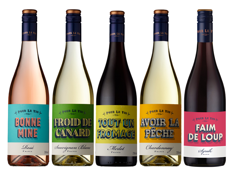
Designed with the multiple off-trade in mind, the aim of this jaunty line-up was to “create an energetic range of wines to introduce non-wine drinkers to an easy-going brand while bringing something refreshing for current consumers”. By rooting itself in French Vin de Pays, the “graphic and colourful French Bistro feel” could be complemented by varietal labels, with playful names also adding the easy appeal.
With such apparent simplicity, yet so well executed, this “appealed in all the right ways” to our judges, being “perfectly pitched” for its £7.99 price point, with the range “working very well”. Comments were invariably upbeat, the wines being “fun, listening to the consumer”, with “colour and tones that are vibrant” but “not too exotic”, and with the “detailing and craft in the typography being very nicely done”. As the judges also noted, this is a range that you could “grab off the shelf and take to a friend’s [house]” but it still “looks impressive”, making for a “perfect Tuesday night, or any night, wine”.
Best New Spirit
Tread Softly
Gin and Vodka
Brand owner: Fourth Wave Wine
Design agency: Denomination
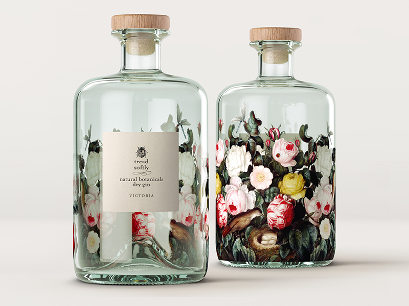
Originally conceived as a (Design Awards-winning) wine range, Tread Softly is described by Denomination as a brand developed in response to a client that wanted a “new generation wine for the next generation drinker”. This new gin and vodka – its first sprits extensions – are also aimed squarely at “the values of millennials and Gen Z”, by looking and feeling sublime. By continuing to disrupt design expectations in the spirits sectors too, while complementing the wine branding and design, Tread Softly Gin and Vodka manage to be both stunning and standout, with deliciously intricate detail.
“So beautiful,” said our judges, with “something kitsch, Alice in Wonderland, a ‘drink me’ Victorian feel” about the delicate label and rich floral backdrop, all of which was “a bit mesmerising”. In addition to being “stunning, standing out against others”, while conveying a clear sense or the aromatic botanicals (for the gin) to be found inside, it was also agreed that this would look arresting backlit on the back bar. The mould-breaking cross-category design was also commended for “translating so well through wine bottle, cans, and now spirits bottle, crossing the categories seamlessly, absolutely to its credit”.
Best Redesign
Starward Bottled Whisky Cocktails
Brand owner: Starward Whisky
Design agency: Denomination

With pre-mixed cocktails here to stay, this sparky Australian brand tasked Denomination with creating something that would “overcome consumers’ hesitation in choosing pre-packed cocktails in terms of ease of use and quality of ingredients, as well as play to the convenience role of the product”. The result is an eminently engaging design, at once crisp and modern, with subtle clues and clear cues as to the pre-mixed classic awaiting inside, all delivered in a crunchy, eye-catching way.
“They had the brief and they’ve gone for it”, with this “really tactile” and “appealing” design, our judges concurred, being “really strong” for a more youthful target market than most whisky engages. It was agreed that the range would “sit well together on the shelf, looking great”, with a design that “makes it feel more premium than its price point”. And, by sticking with classic, popular cocktail mixes, the range allows for extension while sidestepping a possibly shorter-lived dive into more esoteric and of-the-moment mixes as the drink-from-home boom begins to level.
Highly Commended: Sustainability
Sea Change Wine
Brand owner: 10 International
Design agency: In house
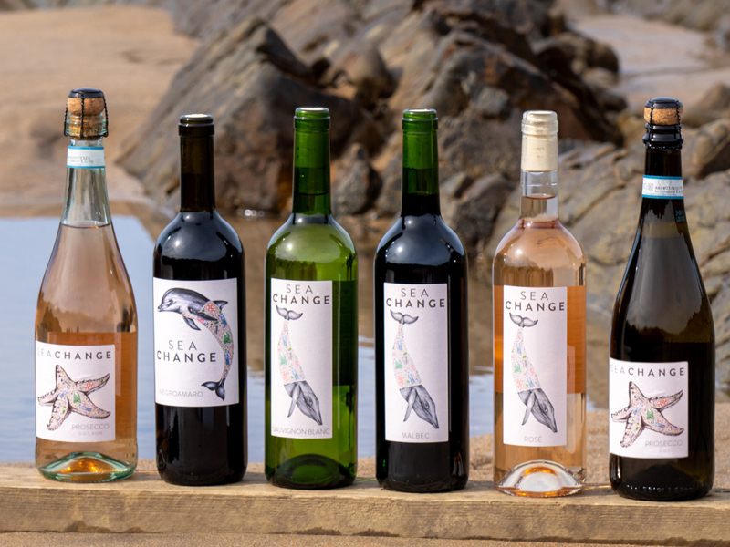
Aimed at a target audience of eco-aware 25- to 55-year-olds, with female drinkers to the fore, the marine animal labels on Sea Change Wines “had to symbolise the raison d’etre behind our brand”, strongly believing “that turning the tide on the juggernaut that is plastic pollution is only going to happen if we all make changes”, according to 10 International.
Eye catching, instantly recognisable and with superb attention to subtle design detail, these wines clearly impressed our judges. Comments ranged from “Fantastic detailing in the illustrations”, which “really draw you in”, while the range “hangs together really well, feeling consistent”, and with added love for the pared-back, foil-free tops. This is design that tells the story well, “developing as you look at it and drink the wine”, pairing those animals with a clear message about the plastic damage being done.
Highly Commended: Innovation
The Online Wine Tasting Club
Brand owner: Urban Craft Wines
Design agency: Urban Craft Wines

Urban Craft Wines set out “to create the lightest, smallest, lowest-carbon way to allow customers to taste wines so they could discover them”, with durability of the sample delivery vessel and the possibility of ratcheting up scale of production also central to the brief. The resultant 2.5g fully recyclable aluminium foil pouches, sealed with inert gas on Urban’s own production line, packaged in totally plastic-free recycled cardboard shipping boxes, hits all these criteria, while looking very appealing too and fitting though the letterbox.
Judges were impressed by the way Urban had “thought about every step of the process”, ensuring highly sustainable and “very modern” packaging, which showed “genuine innovation” in an increasingly sustainability focused world.
Moreover, coloured cues and graphics were used cleverly to hint at the personality of the wines, being “fun and appealing”, offering “an experience that is very consumer friendly”. One judge, with a wealth of experience working on gift sets, confirmed just how “hard it is to create” such a package to meet all of the parameters set here, underpinning this well-deserved Special Commendation.
Design Agency of the Year
Denomination

Fronted by Rowena Curlewis (pictured), Denomination excelled at this year’s Harpers Design Awards, sweeping up five of the winning awards, with many exquisite and cleverly crafted examples of how the best design combines science, art and a canny knack for bringing many differing strands together to maximum effect.
Visually, all of the Denomination entrants ran from eye-catching to stunning. But it was the attention to the fine detail, the folding in of often subtle cues and clues, and the creation of designs that transcended ‘normal’ category boundaries to appeal to fresh and new groups of consumers that really impressed. As one judge commented, “they don’t seem to have a put a foot wrong”.
The Results in Full


Keywords:
Search
Digital Editions


56-58 Church Walk, Burgess Hill, West Sussex, RH15 9AN
Registered in England No. 6646125. VAT No. 938 4452 95