Harpers Design Awards 2018: The winners
Good design may only sell the one, first bottle if the liquid inside is discovered to be below par. But present the most sublime booze in a mediocre or off-putting package and the painstaking craft of the distiller or winemaker is likely to be left collecting dust.
Put simply, design and packaging matters. Both from a commercial perspective and to help guide consumers to the right choice for them, while reassuring by delivering a feelgood factor that fits with aspirations and intended drinking occasion.
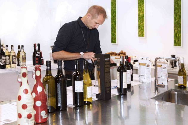
It’s this thinking that provides the backdrop to the rigorous judging process at Harpers’ annual Design Awards. A first round assesses each entry according to its initial impact, originality, creativity, innovation, relevance to the target market and, finally, whether it meets the design brief.
Scores crunched and anomalies debated, a second round of judging then directs our panel to revisit the very best entries and debate which deserve to be awarded the highest accolades – our Trophy winners for Harpers Design Awards 2018.
Our judges, drawn from the worlds of design and the drinks trade, set the bar high, meaning that a Design Award at any level is a real achievement. To be one of the 13 Gold, two Highly Commended or seven Trophy winners is very high praise indeed.
Supreme Champion, Best New Brand and Best Spirit Design
Pierre Ferrand 10 Générations Cognac
Brand owner: Maison Ferrand
Design agency: Stranger & Stranger
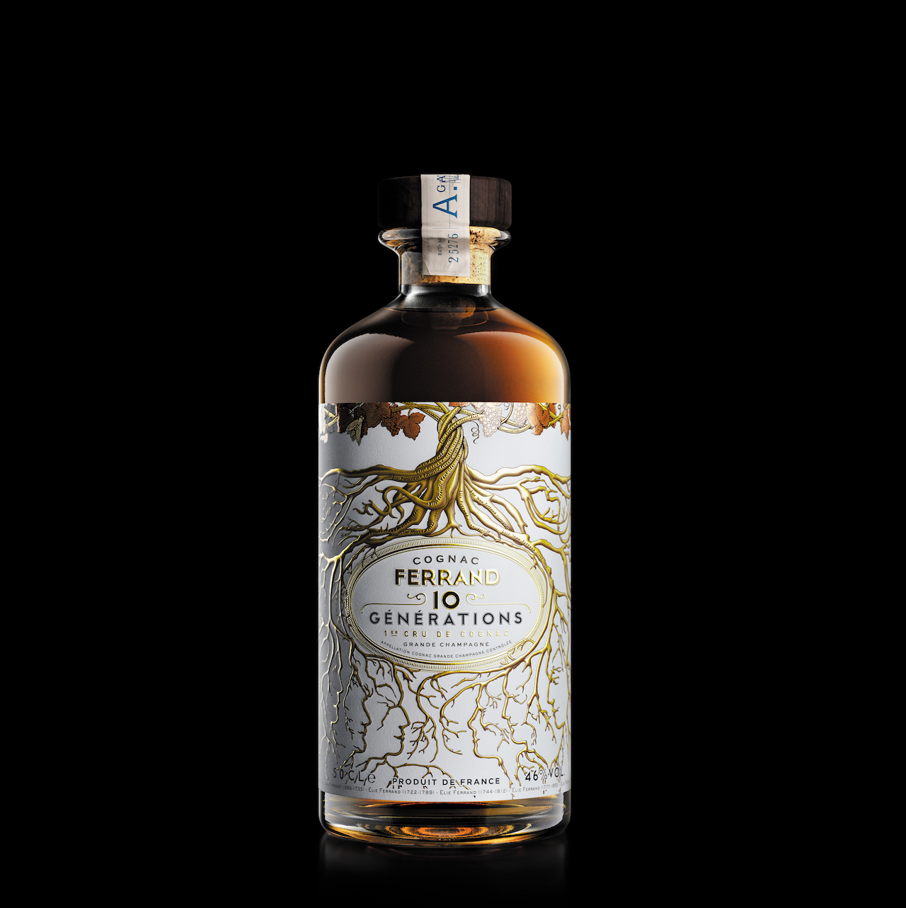
This smart and eye-pleasing cognac swept the board, with judges unanimous about its elevation to our Supreme Champion award. The label design not only looked at first sight to be a beautiful modern interpretation of the colours and feel often attributed to the category, but gradually gave up more details on closer inspection, with the golden roots of a vine containing the silhouettes and names of the 10 generations behind the spirit.
“Beautiful, thoughtful design, that embodies the concept and is delicately executed,” said Katie Raath, capturing the general mood and delighted approval among the judges.
Best Wine Design
The Prisoner Wine Company’s Dérangé
Brand owner: Constellation Brands
Design agency: Stranger & Stranger

“Get it, like it, want it” wrote one judge of this enthusiastically received and cleverly designed package. Very cool, offering something totally different from the usual world of wine, with many subtle and more overt cues hinting at the qualities of the liquid inside this US$100-a-pop bottle. Moreover, the packaging itself oozed quality, managing to be both eye-catching and intriguing in equal measure.
“Original, thoughtful, quirky and humorous without being a joke – a lovely idea, well executed,” said Sarah Bustin.
Best Established Brand
Bareksten Botanical Gin
Brand owner: OSS Craft
Design agency: Kind
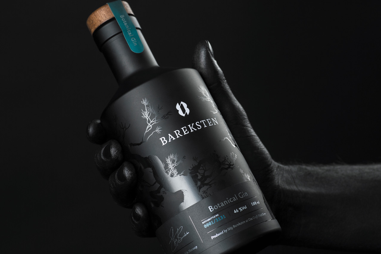
Noted for its really strong imagery and striking looks, this combined cues of quality, mystery, craft and exclusivity in the one, dark, brooding and somewhat cultish packaging. It was agreed that this met the brief very well indeed, creating a gin bottle that clearly stands out from the crowd, while suggesting a spirit that draws on its Scandinavian roots and natural northern habitat.
“A great bottle, incredible imagery, really strong, cult but friendly, with lasting impact,” said Duncan Watts, echoing the sentiments of his fellow judges.
Best Repackaging
Dow’s Aged Tawnies
Brand owner: Symington Family Estates
Design agency: Denomination
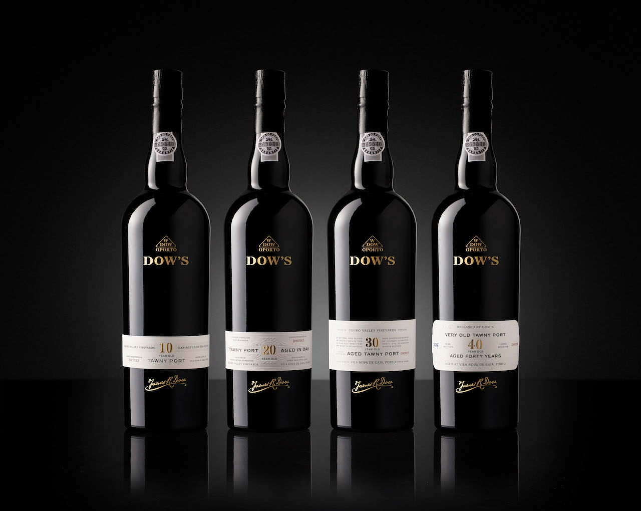
Taking a venerable range and teasing the design into the modern era can be a challenging task, but all agreed this range of Dow’s tawny Ports had hit the nail on the head, with a seductive, subtle, yet highly accomplished upgrade to the design, with the lettering, texture of paper label and overall styling winning high praise from all.
“A beautiful, stunning range, lovely execution,” was the simple summation of Toby Wilson.
Best Range
Dasher + Fisher Gin
Brand owner: Southern Wild Distillery
Design agency: Co Partnership

Praised for its clarity and punchy, memorable labelling, plus the clever use of botanical imagery visible through the spirit on the inside of the bottle, this eminently extendable range’s branding spoke eloquently of a Tasmania seaside vibe, but in a wholly modern way. Small details like the capsule, crisp font and the tactile shape of the bottle also impressed our judges.
“Simple, clean, from the ocean side, so does the job well – and I love the inside back label imagery, it makes you really hold the bottle and take a good look,” said an impressed Duncan Watts.
Best Innovation
The Owl & The Dust Devil
Brand owner: Finca Decero
Design agency: Stephanie Morton-Small
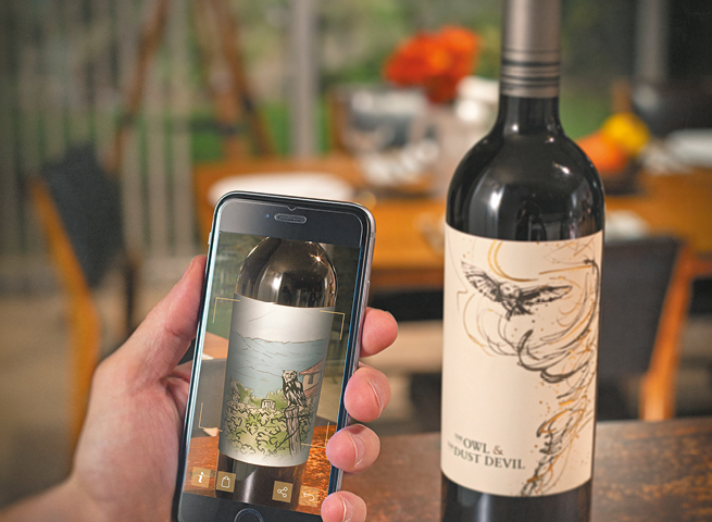
This label looks captivating enough on its own, but take a few seconds to download the app, point your phone at the bottle and hey presto! – the label comes alive, with dust devil swirling, owl flying and a voiceover introducing you to the wine inside. It’s early days for augmented reality (AI) labels, but this gem makes a fantastic job of showing where this can go, with a charming back story and imagery to match this very clever innovation.
“Beautiful, poetic and unique, the concept relates integrally to the brand and is so well executed,” said an approving Katie Raath.
Best Agency
Stranger & Stranger
With 2018’s Supreme Champion to its name, along with a string of other high-scoring and highly praised designs including the extraordinary Dérangé bottle, the exotic Cornwall-meets-Caribbean vibe of Rathlee Rum and mould-breaking work of art that is the Phenomenology whisky label, Stranger & Stranger’s exceptional work shone bright at this year’s Design Awards.
These are designs that are at once arresting, stunning, disruptive and yet anchored on brief, while genuinely generating mind-engaging cues as to the provenance, character and quality of the liquid inside the bottle.
Highly Commended Spirit
Rathlee Rum
Brand owner: Rathlee Distilling Company
Design agency: Stranger & Stranger

Well-drawn, playful and buzzing with colourful imagery and details, this was a neat play to create a strong and distinct identity for a Cornish rum while bridging the oceanic divide with a nod to its cousins in the Caribbean. A well-conceived and well-crafted package that drew our judges to the bottle.
“This hangs together gorgeously and the gold engraving details are exquisite,” remarked Katie Raath.
Highly Commended Presentation Box
Midleton Very Rare
Brand owner: Pernod Ricard/Irish Distillers
Design agency: Nude Brand Creation
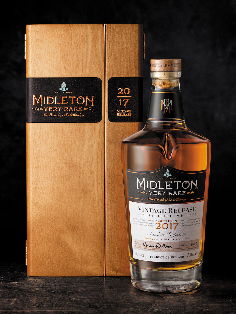
A hit for bringing a traditional category into the contemporary era without losing sight of its origin or heritage. This presented as a serious, hand-crafted, well-made, quality-feeling presentation box that upheld the brand values communicated by the attractive bottle. The copper trim and black lining completed a compelling and attractive box, complementing the whisky within.
“A beautifully executed piece of packaging – the complete package,” Toby Wilson decreed, in tune with his fellow judges.
Our Design Awards Judges
Sarah Bustin, independent senior creative, ButterflyCannon
Katie Raath, independent creative consultant, Kilo Romeo
Duncan Watts, founder, The Curious Group
Toby Wilson, chief operations officer, MW Luxury Packaging
Andrew Catchpole, editor, Harpers Wine & Spirit
For the full results, including all Gold, Silver and Bronze winners, see Harpers digital edition or click here.
Keywords:
- wine
- Spirits
- packaging
- Denomination
- 2018
- Constellation
- label
- Owl & the Dust Devil
- winners
- Harpers Design Awards. Stranger & Stranger
- Sarah Bustin
- ButterflyCannon
- Katie Raath
- Kilo Romeo
- Maison Ferrand
- Prisoner Wine Company
- Bareksten Botanical Gin
- OSS Craft
- Dow’s Aged Tawnies
- Symington Family Estates
- Dasher + Fisher Gin
- Rattle Rum
- Midleton Very Rare


